
Colors
Aug 13, 2024
The Psychology of Colors in Graphic Design
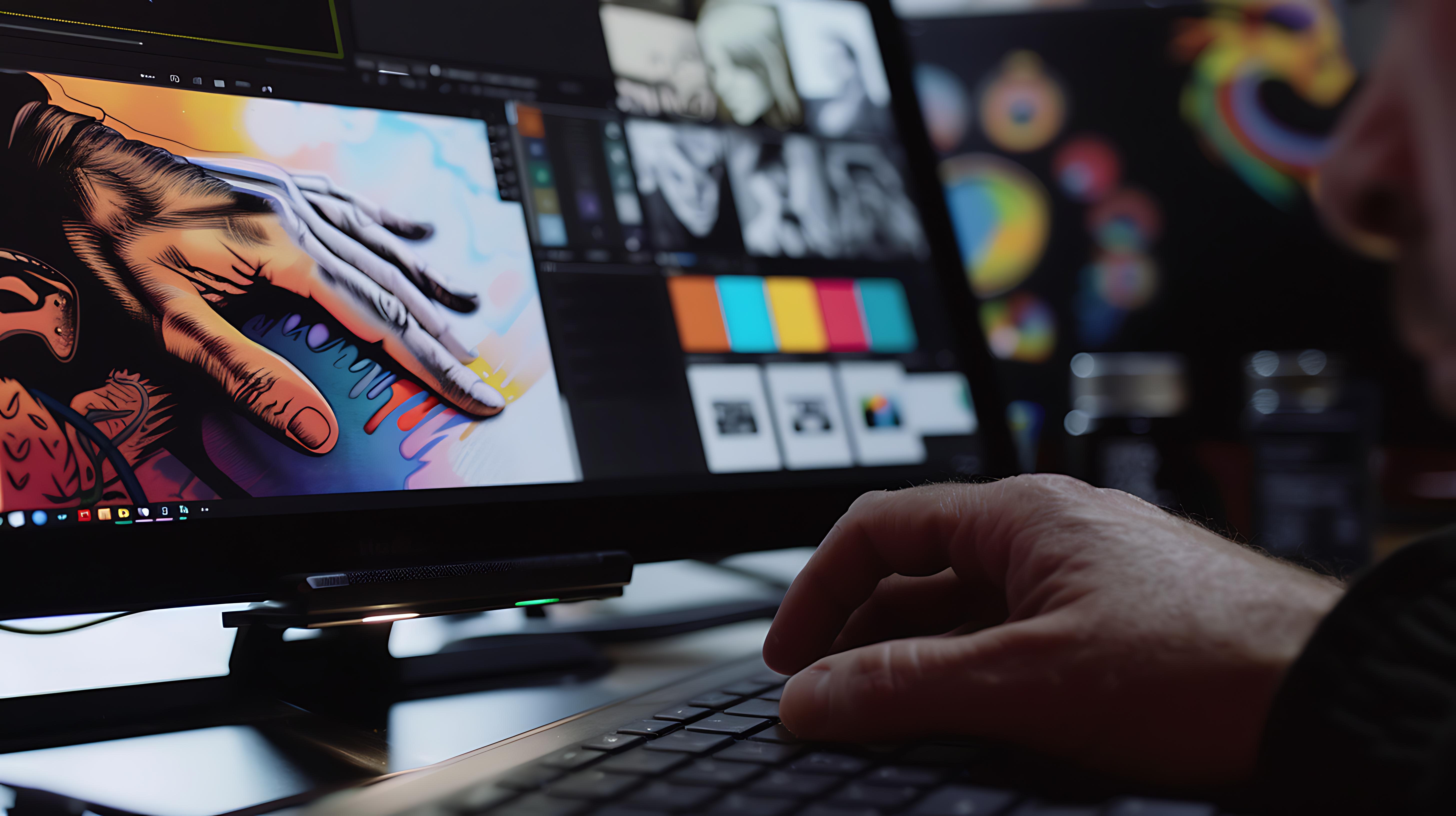
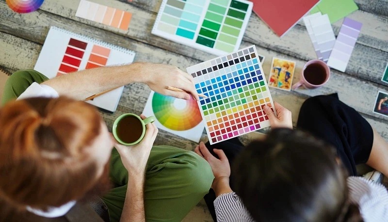
Color is one of the most powerful tools in graphic design, influencing emotions, perceptions, and behaviors. The right color choices can make a design feel energetic, calming, luxurious, or even urgent. Whether you’re designing a brand identity, marketing materials, or a website, understanding color psychology can help you craft visuals that resonate with your audience and drive action.
Every color carries psychological meaning and affects how people interact with designs. Studies show that colors influence 85% of a customer’s purchase decision, making it a critical factor in branding and marketing. Businesses and designers who leverage color psychology effectively can enhance brand perception, establish trust, and even increase conversions.

Key Colors and Their Psychological Effects
01. Red: Passion, Energy, and Urgency
Red is a bold and dynamic color that commands attention. It stimulates emotions like excitement, love, and urgency, making it an ideal choice for brands looking to drive action.
Through engaging and intuitive digital experiences, we help you enhance user satisfaction and drive your business forward.
02. Blue: Trust, Professionalism, and Calmness
Blue is often associated with stability, reliability, and tranquility. It’s widely used in corporate branding, as it instills confidence and professionalism.
Darker blues create a sense of authority and trust, while lighter blues are more calming and friendly.
03. Yellow: Creativity, Optimism, and Warmth
Yellow is a bright, energetic color that evokes happiness, positivity, and creativity. It’s commonly used to grab attention and convey a sense of friendliness.
Too much yellow can be overwhelming, so balance it with darker tones or use it as an accent color.
04. Green: Nature, Sustainability, and Health
Green is associated with growth, freshness, and environmental consciousness. It’s often used by brands that focus on sustainability, health, and finance.
Dark greens convey wealth and stability, while lighter greens are refreshing and energetic.
05. Orange: Enthusiasm, Confidence, and Playfulness
Orange combines the energy of red with the warmth of yellow, making it an inviting and friendly color. It’s often used to create excitement and encourage engagement.
Use orange to create urgency, but avoid overusing it in serious or luxury branding.
06. Black, White & Neutrals: Timelessness, Elegance, and Simplicity
Black, white, and gray serve as essential neutral tones in design.
Neutrals are perfect for backgrounds and typography, helping other colors pop while maintaining balance in design.
Color psychology is a game-changer in graphic design. The right colors can shape emotions, influence decisions, and elevate a brand’s presence. By strategically applying color theory in your designs, you can create visuals that leave a lasting impact on your audience.
Subscribe
Services
Contact with us for any advice

09 : 00 AM - 10 : 30 PM
Saturday - Thursday